I
The Frosty Mug pieces were die cut twice to create the reverse image for the back as well. Instead of colouring the beer, I used one of the Champagne slimline papers. The glass part of the mug was die cut from alcohol marker (AMF) friendly cardstock and coloured with light cool gray Copic Sketch markers. The foam was die cut from a scrap of off-white cardstock and the edges inked with Antique Linen distress ink.
Masking was done directly on the sentiment stamp from Brewskis stamp set so the sentiment would all be on one line. It was stamped with VersaMark ink and heat embossed with white embossing powder on black cardstock then trimmed to a strip. Assembled the card. Embellished with some circle clear drops to finish.
My second card was straight forward. Stamped the image from Brewskis stamp set with Memento Tuxedo Black ink on AMF cardstock and coloured with Copic Sketch markers. Masked the image then ink blended light gray dye ink over the Brick Pattern stencil.
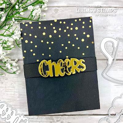
The Shaker Maker Rectangle frame was in my stash. Die cut Cheers! from gold foil and black cardstock to offset for a drop shadow. Assembled the card onto a white card base to finish.
To view the February new release products, click HERE. Thank you for stopping by.
WS products: *compensated affiliate links used at no extra cost to you… thank you for your support*
Challenges:


8 comments:
Two terrific cards, Trina!
A fabulous pop-up CAS, so cheerful and creative with the gold sentiment on the bell band and the confetti! The beer has a fabulous realistic look! Wow!
Also the second one is very impressive, you have always brilliant ideas and put them to fabulous results!
Hugs
Awesome pop up card Trina, Love the beer theme on both :)
Two beautiful cards, Trina. I love both. Thank you for great inspiration. This is a card that I have to make someday :-)
hugs,
BożenA
Two great cards for beer lovers! Fabulous pop-up card - so clever. And great colouring and framing on the second card.
This is a fantastic pop-up card, Trina! Seeing is believing, isn't it? Thanks for the video! Using campaign paper for the beer and arranging the sentiment in one line are clever. The circle clear drops are nice icy touches too.
Masking and coloring of the second card are wonderful. The light brick wall stenciling is a perfect backdrop for the images.
Hideko xx
You are so clever, Trina! I LOVE this pop up card and that glass of beer is so realistic! Your coloring is perfection! The second card is just as realistic! Wow! Cheers, my friend!
Oh, what a fab card, the pop up beer looks amazing - so life-like. It's been so stinkin' hot here in Australia today that I could really go a beer! LOL. Thanks for sharing with us at Just Add Ink.
Post a Comment